Ampersand is a non-profit organization that grants scholarships for talented Ukrainian students. The team contacted me to create a comprehensive branding and website design for the organization. I led the entire project and worked on creating a unique design system that later implemented it into all design solutions.
UX and Visual Designer: Lisa Kuznietsova
UX and Visual Designer: Lisa Kuznietsova
01: About the project
The challenges I met
Though the whole process, I met two different types of challenges: branding and information architecture related. The first obstacle was to create branding that would be not that cliched, which meant no books in the logotype. Second of all, the question was how to organize all the information for users to navigate through it easily.
Design approach
For the logotype design, I decided to use one of the Gestalt psychology principles. Figure-Ground organization principle of Gestalt psychology describes perceptional phenomena when humans eye separates visual elements as they are in a 3D world. For the website, I decided to go with a simple landing page structure that included CTA buttons.

Appearance
The client said from the beginning that a logo was going to be used primarily in digital, so I haven't had constrictions of the logo appearance. Although, it still was important to consider the possibility that the logo would need to be printed in one color. Also, the client liked the idea of using blue hues, so I proposed a few options, and we ended up with a dark blue shade that we use as the backdrop or as a saturated accent on the dark backgrounds.
02: Research
Persona
Persona
It's essential to understand User's desirability in the earliest stages of the process and to make sure that the final product has the right tasks, meets User's needs, and supports goals. So to provide empathy, insights, and design direction, I created personas.
User flow
To understand how I can improve the navigational flow and see the pain points of information architecture, I decided to model the user flow.

03: Visual design
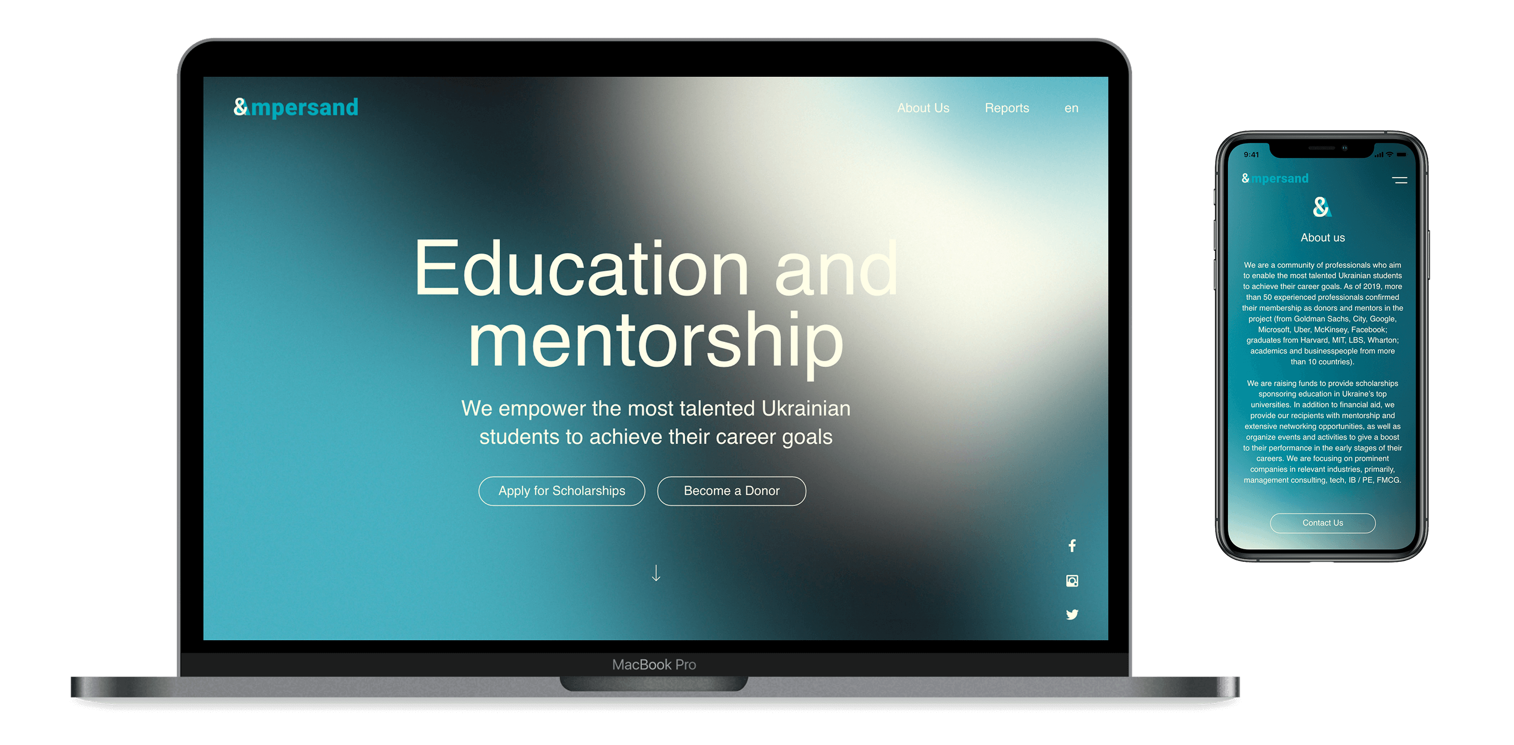
Home page
The main page got the looped animation with abstract colors that represents the continuous movement of personal and professional growth.
Icons
To show the features of the scholarship program, I designed custom icons. Also, I decided to go with a two-color appearance to maintain the contrast.
Final result
As a result, we got a landing page with a sleek design that functions to stimulate both personas to get to the main actions – applying for the scholarship and donating. To deliver credibility, I decided that it would be nice to show the social proof on the landing. Thus, I used reviews from students and donors from the past.


04: Mobile version
Responsive design
This project was desktop first, so I designed the mobile version afterwords. It was relatively easy to transform the web version to the mobile as it didn't have a complicated structure.


05: Prototyping
Clickable and testable
A clickable prototype is a very important step in product development. In this case, it gave the possibility to test the product and notice the sections that need to be improved.
06: Summary
Reflections
This project was challenging because the branding required bringing both educational and contemporary feel. I ended up with a straightforward solution for the logo and style that makes the design work in the best possible way. The website architecture was also a challenge in a way that I needed to show one type of information in different ways. But it turned out both easy to use and visually pleasing.